Looking for the most readable Google Fonts for your website? We’ve rounded up the top legible serif and sans-serif fonts to boost your website’s readability and keep visitors engaged.
Key Takeaways —
- Most readable sans-serif fonts: Open Sans, Roboto, Lato
- Best legible serif fonts for reading: Merriweather, PT Serif, Source Serif Pro
- Pair serif headings with sans-serif body text for visual appeal and hierarchy
- Pay attention to x-height, letter spacing, and font weight for legibility and readability
- Test fonts on different devices for consistent readability
Google Fonts has become a go-to resource for web designers and developers seeking to enhance their websites’ typography.
With over 1,450 font families available, these open-source typefaces offer a perfect blend of style and functionality.
Good typography shapes how users interact with your content. The right font can boost readability, reflect your brand, and leave a strong impression.
This guide will help you pick the most legible Google Fonts for your site, whether you’re new to web design or a pro.
- Why Typography Matters in Web Design
- What are Google Fonts?
- Google Fonts Facts
- Top Readable Google Fonts for Blogs and Websites
- What are the Best Google Font Combinations for Web Readability
- Practical Applications of the Most Readable Google Fonts for Optimal Online Legibility
- How to Implement Google Fonts on Your Website
- Best Practices for Using Google Fonts
-
FAQs About Google Fonts
- What are the most readable Google fonts for blogs?
- How do Google fonts impact website performance?
- Can Google fonts be used for commercial projects?
- Can I download Google Fonts for design software?
- Which is the best Google font for small text?
- Which is the most legible script font on Google?
- What are the best Google fonts for reading?
- Is there a readable cursive font in Google Docs?
- What’s the best readable Google font?
- Final Thoughts
Why Typography Matters in Web Design
Typography plays a crucial role in web design, influencing how users interact with and perceive your content. Here’s why it matters:
- Readability — Well-chosen fonts make your content easier to read, keeping visitors engaged.
- Brand Identity — Fonts contribute to your site’s personality and reinforce your brand image.
- Visual Hierarchy — Typography helps organize content, guiding users through your site.
- User Experience — The right fonts can improve overall site usability and aesthetics.
- Accessibility — Proper font selection ensures your content is readable for all users.
Typography accounts for a significant portion of web design.
It’s not just about choosing attractive fonts; it’s about creating a pleasant reading experience that keeps users engaged with your content.
By paying attention to typography, especially readability, and accessibility — you can enhance your site’s effectiveness and user satisfaction.
What are Google Fonts?
Google Fonts is a free, open-source library of web fonts launched in 2010. These fonts can be used on websites without licensing fees and are easily integrated into web projects.
Key benefits of Google Fonts include —
- There are over 1,450 font families available.
- Integration with websites is easy with a few lines of code.
- Fonts are optimized for fast web loading with an average load time of 50-100 ms.
- They render consistently across different browsers and devices.
- New fonts are regularly added.
- Many fonts come with multiple weights and styles for customization.
On the other hand, using Google Fonts can raise privacy concerns — as requests to Google’s servers can track user data. There might be compliance issues in regions with strict data privacy laws such as the European Union.
Google Fonts Facts
Here are some Google Fonts facts you might find interesting:
- Over 70% of websites use Google Fonts on the web.
- Open Sans is the most used font for body text.
- Merriweather is the most popular serif font.
- Roboto is the most downloaded Google Font.
- More than 400 Google Fonts support Cyrillic script.
- Google Fonts supports over 135 languages.
- The average file size of a Google Font is between 30-50 KB.
- Google Fonts typically load in 50-100 milliseconds.
Top Readable Google Fonts for Blogs and Websites
Choosing the right font can significantly enhance your website’s readability and overall user experience.
Here am going to list some of the most readable Google Fonts, which are categorized by type — Sans-Serif Fonts, Serif Fonts, and Display typefaces:
Most Legible Google Fonts: Top Sans-Serif Choices
Sans-serif fonts, characterized by their lack of extending features at the end of strokes, are often perceived as modern, clean, and minimalist.
Here’s a selection of the 10 most readable Google fonts in the sans-serif category —
1. Open Sans
Designed by Steve Matteson, Open Sans is one of the most popular Google fonts, used on over 30 million websites.
Its neutral, friendly appearance and excellent readability across sizes make it a versatile choice for various web projects, including major platforms like YouTube.
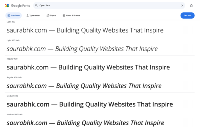
Open Sans is THE MOST USED Google Font for BODY TEXT.
2. Roboto
Created by Christian Robertson for Google, Roboto is the default font for Android and Chrome OS. Used on more than 26 million websites, including Google’s own sites.
The Roboto font family has 12 styles and offers a clean, modern look with a mechanical skeleton and largely geometric forms.
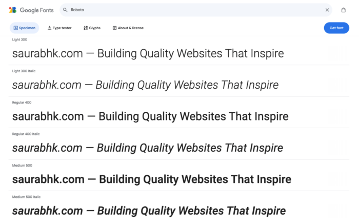
Roboto is THE MOST POPULAR Google Font in the library.
Roboto is THE MOST DOWNLOADED Google Font.
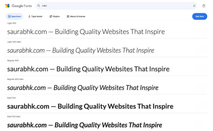
3. Lato
Designed by Łukasz Dziedzic, Lato (meaning “Summer” in Polish) has a warm and stable appearance.
Used on over 15 million websites, it’s known for its versatility and readability across various sizes, making it popular for corporate websites and startups.
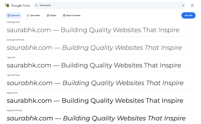
4. Montserrat
Inspired by old posters and signs in the Montserrat neighborhood of Buenos Aires, this font was designed by Julieta Ulanovsky.
Used on more than 15 million websites, Montserrat’s geometric, clean design makes it popular for modern, minimalist web designs.
5. Nunito
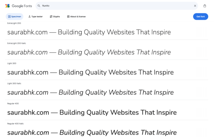
Designed by Vernon Adams, Nunito is a well-balanced sans-serif with rounded terminals.
Its friendly appearance and high legibility make it popular for over 3.7 million websites, particularly those targeting younger audiences or education sectors.
6. Source Sans 3 (formerly Source Sans Pro)
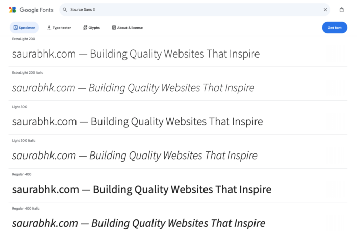
Adobe’s first open-source typeface family, designed by Paul D. Hunt, Source Sans Pro is used on more than 8 million websites.
Its clear forms and wide range of weights make it adaptable for various design needs, from user interfaces to long-form articles.
7. Poppins
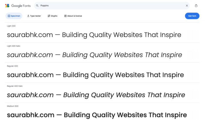
A geometric sans-serif designed by Indian Type Foundry, Poppins has gained popularity for its modern, friendly appearance.
Used on over 5 million websites, it’s particularly favored by tech startups and creative agencies for its clean, approachable look.
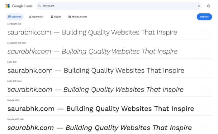
8. Work Sans
Created by Wei Huang, Work Sans is optimized for on-screen text usage at medium sizes. Its large x-height contributes to its high readability.
Used on more than 1 million websites, it’s popular for its balance of professionalism and approachability.
9. Inter
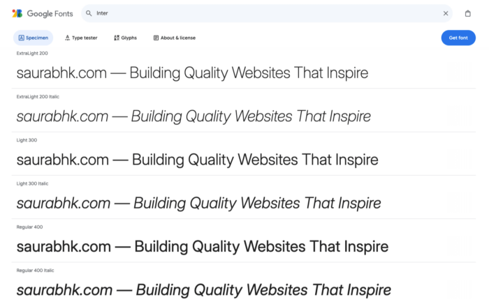
Designed by Rasmus Andersson, Inter is a font family specially designed for user interfaces. Its tall x-height and open forms make it highly legible on screens.
Used on over 500,000 websites, it’s particularly popular among tech companies and digital products.
10. Ubuntu
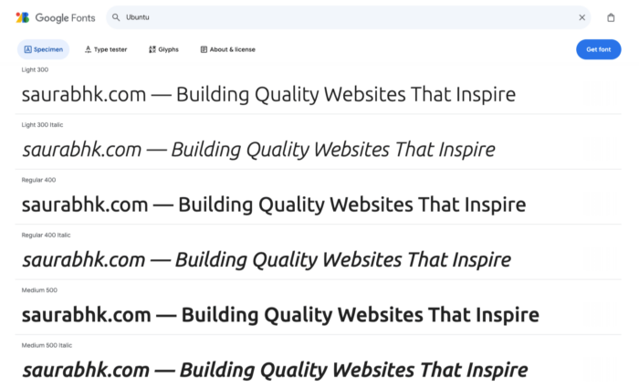
Developed by Dalton Maag for Canonical Ltd., Ubuntu is the default font for the Ubuntu operating system.
Used on more than 3 million websites, its modern, slightly rounded design makes it popular for tech-related websites and blogs.
These sans-serif fonts are among the most readable Google fonts for web use.
Best Google Serif Fonts for Reading Online
Serif fonts, characterized by small lines or strokes at the ends of characters, are often associated with tradition, reliability, and formality.
Here are some of the most readable Google serif fonts —
1. Merriweather
Designed by Eben Sorkin, Merriweather is optimized for screen readability. It features a large x-height, slightly condensed letterforms, and open forms.
Used on over 20 million websites, including WordPress.com, Merriweather offers excellent legibility for long-form content.
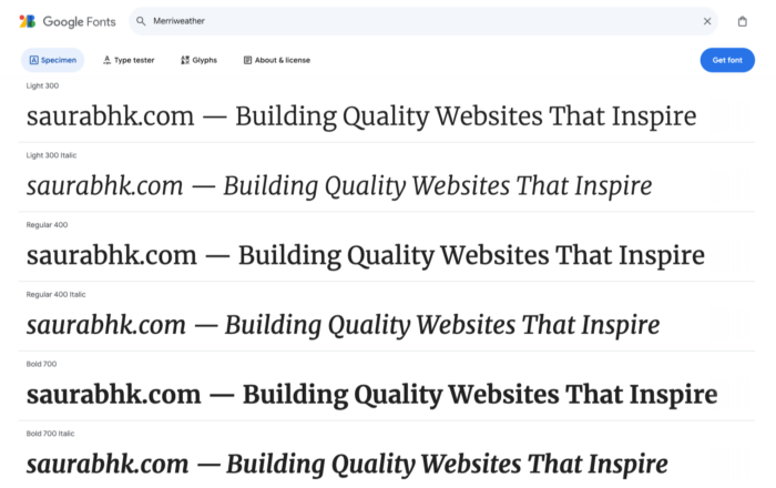
Merriweather is THE MOST POPULAR SERIF FONT.
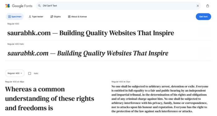
2. DM Serif Text
Created by Colophon Foundry, DM Serif Text is an elegant transitional design. It’s featured on more than 28 thousand websites and pairs well with Georgia for body text.
DM Serif Text is particularly popular for fashion and lifestyle blogs due to its sophisticated appearance.
3. Lora
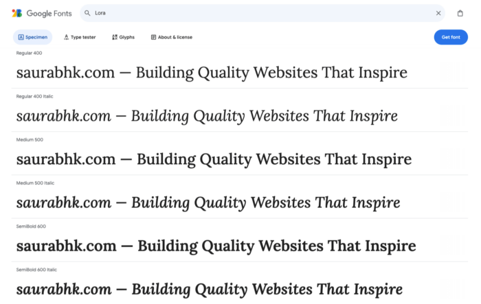
Lora, designed by Cyreal, is a well-balanced contemporary serif with roots in calligraphy. Optimized for both web and print, it’s used on over 1.5 million websites.
Lora’s brushed curves give it a warm, inviting feel, making it ideal for personal blogs and storytelling platforms.
4. PT Serif
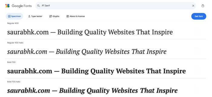
Developed by ParaType, PT Serif is part of a superfamily designed for use in the public domain. It supports over 500 languages and is used on more than 1 million websites.
PT Serif’s versatility makes it a go-to choice for multilingual websites and government portals.
5. Noto Serif
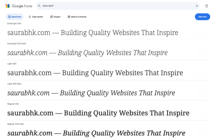
Created by Google, Noto Serif is part of the Noto font family, designed to cover all languages.
It’s used on over 550,000 websites and is particularly popular for its consistency across multiple scripts, making it ideal for global brands and educational websites.
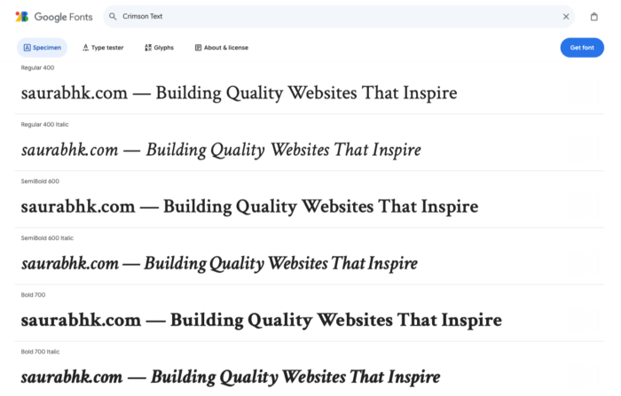
6. Crimson Text
Designed by Sebastian Kosch, Crimson Text is inspired by old-style typefaces.
Its high contrast and elegant forms make it suitable for both headings and body text. Used on over 300,000 websites, it’s particularly favored by literary and academic sites.
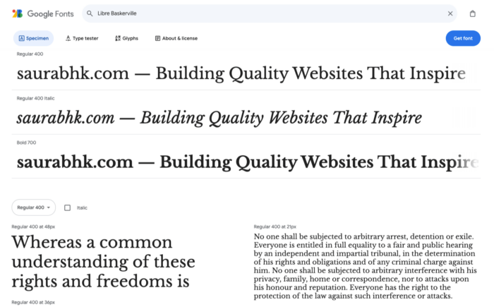
7. Libre Baskerville
A web-optimized version of the classic Baskerville font, Libre Baskerville was created by Impallari Type.
Used on more than 2 million websites, it’s known for its excellent readability at small sizes, making it perfect for mobile-responsive designs.
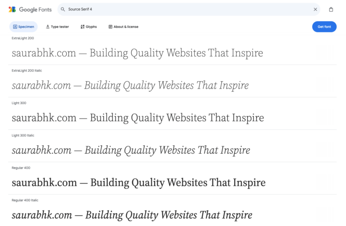
8. Source Serif 4 (formerly Source Serif Pro)
Designed by Frank Grießhammer for Adobe, Source Serif Pro is an open-source font used on over 200,000 websites.
Its clean, modern interpretation of traditional serif designs makes it popular for tech blogs and digital publications.
9. Roboto Slab
Created by Christian Robertson for Google, Roboto Slab is a slab serif companion to the popular Roboto sans-serif font.
Used on more than 3 million websites, it’s particularly effective for creating visual hierarchy when paired with its sans-serif counterpart.

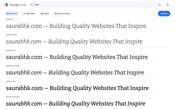
10. Bitter
Designed by Huerta Tipográfica, Bitter is a contemporary slab serif font optimized for screen reading.
Its sturdy serifs and increased x-height make it highly legible even in small sizes. Used on over 500,000 websites, it’s popular for news websites and blogs.
Easy to Read Google Fonts: Display and Script Options
While display and script fonts are typically used for headings or accents rather than body text, some options offer better readability than others.
Here are some of the most readable Google fonts in the Display and Script categories —
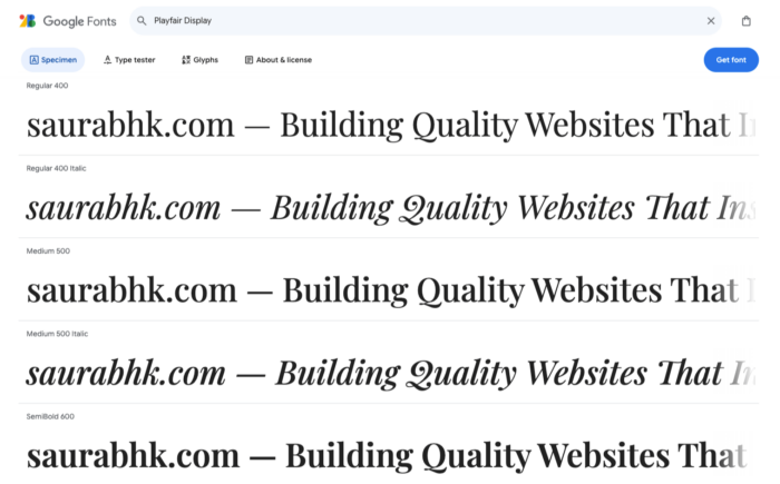
1. Playfair Display
Designed by Claus Eggers Sørensen, Playfair Display is an elegant font that works well for headings and short paragraphs.
It’s inspired by high-contrast transitional typefaces from the late 18th century and has been viewed over 7 trillion times on Google Fonts.
Its readability and sophistication make it a popular choice for fashion and lifestyle blogs.
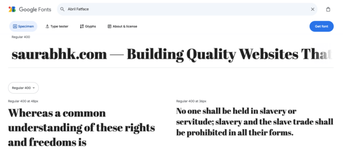
2. Abril Fatface
Created by TypeTogether, Abril Fatface is a bold display font with excellent readability for headlines.
This eye-catching typeface, inspired by 19th-century advertising posters, has accumulated over 2 trillion views on Google Fonts.
It’s often used for magazine headlines and promotional materials where impact and legibility are crucial.
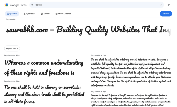
3. Pacifico
Designed by Vernon Adams, Pacifico is a brush script font that’s more readable than many script fonts.
It’s suitable for short phrases or logos, offering a fun, casual style perfect for invitations, social media posts, and branding for laid-back businesses.
Pacifico has garnered over 5 trillion views on Google Fonts, a testament to its popularity and readability.
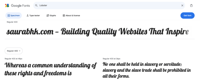
4. Lobster
Created by Pablo Impallari, Lobster is a script font designed specifically for web use, with good readability for a decorative font.
It’s been used on over 20 million websites and has accumulated more than 8 trillion views on Google Fonts.
Lobster is popular for headers, logos, and short, impactful text where legibility is key.
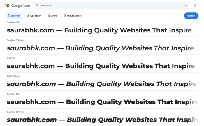
5. Montserrat
While often used for body text, Montserrat also works well as a display font in its bolder weights.
Designed by Julieta Ulanovsky and inspired by urban typography from Buenos Aires, Montserrat has over 18 trillion views on Google Fonts.
Its versatility in both display and text applications has made it a favorite among brands like Spotify and Kickstarter.
When using these display fonts, remember that while they’re considered highly readable for their categories, they’re best used sparingly for headlines, logos, or short sections of text rather than long-form content.
Some More Google Fonts to Consider
Here are some more Google Fonts you can also consider — click on the image to enlarge.


What are the Best Google Font Combinations for Web Readability
Pairing fonts effectively can enhance readability and create visual interest.
Here are 10 recommended Google Font pairings for optimal online legibility featuring some of the most readable Google fonts —
- Playfair Display (headings) + Open Sans (body)
This pairing balances classic elegance with modern readability, making it one of the best Google font combinations for sophisticated websites. - Montserrat (headings) + Lato (body)
A clean, contemporary pairing that strikes a balance between professionalism and approachability, ideal for corporate sites and startups. - Roboto Slab (headings) + Roboto (body)
This harmonious pairing from the same family offers consistency with subtle contrast, perfect for tech-focused websites. - Oswald (headings) + Source Sans Pro (body)
Bold, attention-grabbing headlines complemented by highly legible body text, suitable for news sites or blogs. - Merriweather (headings) + Open Sans (body)
A classic serif-sans serif combination that enhances readability and visual hierarchy, great for long-form content. - Poppins (headings) + Work Sans (body)
A modern, geometric pairing that creates a fresh and friendly atmosphere, suitable for creative industries. - Playfair Display (headings) + Lato (body)
Combines traditional elegance with contemporary simplicity for a balanced look, perfect for lifestyle blogs or fashion websites. - Nunito (headings) + Source Sans Pro (body)
A soft, rounded heading font paired with a clean body text for a welcoming feel, ideal for educational or child-focused websites. - Lora (headings) + Roboto (body)
Marries the warmth of a serif font with the clarity of a sans-serif for versatile designs, suitable for various types of content-heavy websites. - Inter (headings) + Open Sans (body)
A sleek, modern pairing ideal for tech-focused or minimalist websites, offering excellent readability for both headlines and body text.
These are some of the most readable Google font pairings that offer a range of styles and moods, suitable for various website types and brand personalities. For more font-pairing examples you can checkout the fontpair.co.
I have listed them for their readability and complementary nature, ensuring your content remains legible across different sections of your website.
Selecting the right Google Fonts involves several considerations.
I would suggest first start considering factors like readability, brand alignment, performance impact, and accessibility to make the most effective selections for your website.
Remember to test your chosen fonts across different devices and browsers to ensure consistent rendering and readability. It’s always a good idea to test different combinations and gather feedback.
Practical Applications of the Most Readable Google Fonts for Optimal Online Legibility
When applying Google Fonts to your website, consider these practical tips:
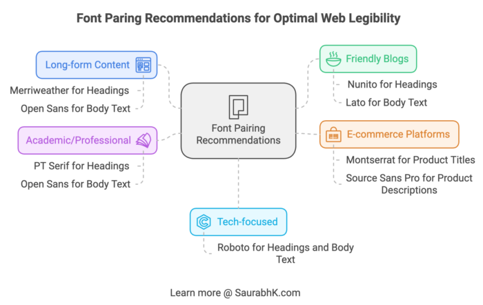
- For long-form content websites (blogs, news sites) —
Use a highly readable serif font like Merriweather for headings and a clean sans-serif like Open Sans for body text. This combination provides excellent legibility for extended reading sessions. - For tech-focused websites —
Consider using Roboto for both headings and body text. This creates a cohesive, contemporary feel that aligns well with tech-oriented content. - For friendly, approachable blogs —
Try Nunito for headings and Lato for body text. This pairing creates a warm, inviting atmosphere that can help build a connection with your readers. - For e-commerce platforms —
Use a bold, attention-grabbing font like Montserrat for product titles and a highly legible sans-serif like Source Sans Pro for product descriptions. - For academic or professional websites —
Consider pairing PT Serif for headings with Open Sans for body text. This combination balances professionalism with readability.
How to Implement Google Fonts on Your Website
Adding Google Web Fonts to your website is a straightforward process:
- Visit fonts.google.com and choose your desired font.
- Click the “+” icon to select the font styles you want.
- Open the selection drawer at the bottom of the page.
- Copy the provided HTML link tag.
- Paste the link tag in your HTML file’s
<head>section. - Use the font in your CSS by specifying the font family name, like this:
body { font-family: 'Roboto', sans-serif; }
For WordPress users:
- Most WordPress themes have built-in Google Fonts options. Check your theme’s customizer settings.
- You can use plugins like “Fonts Plugin” or “Easy Google Fonts“.
- For manual integration, add the link tag to your theme’s header.php file.
Remember to consider performance when adding web fonts. Limit the number of font weights and styles to keep your site running efficiently.
Website performance relies on Google’s server uptime, and extra HTTP requests can slow down page load times. To overcome the performance issue due to web fonts, I would suggest the following options —
- Consider using Web Safe Fonts over Web Fonts.
- Self host Google Fonts to improve page loading speed.
- Deliver Google Fonts via Cloudflare for improved performance.
Best Practices for Using Google Fonts
To make the most of Google Fonts on your website:
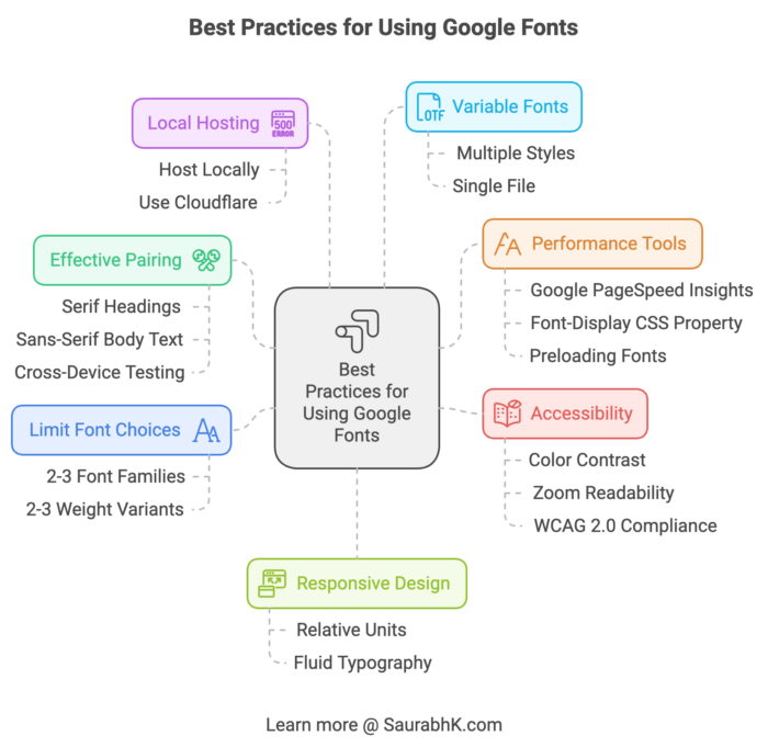
- Limit your font choices to 2-3 font families, each with 2-3 weight variants. This helps maintain visual consistency and improves load times.
- Pair fonts effectively by combining those with different characteristics, like serif headings with sans-serif body text, for contrast and harmony. Don’t forget to test your fonts across various devices and browsers to ensure consistent rendering.
- Use tools like Google PageSpeed Insights to check how fonts affect your site’s performance. The font-display CSS property can help you control how fonts load and display. Consider using
{ font-display: swap; }to show text immediately, and think about preloading critical fonts. - Host Google Font locally — for improved performance and reliability. Or use Cloudflare to deliver Google fonts.
- Variable fonts can be a great option when you need multiple styles, as they pack several variations into one file.
- Keep accessibility in mind too. Make sure there’s enough color contrast and that your text stays readable when users zoom in. As per the WCAG 2.0 level AA, the required contrast ratio should be at least 4.5:1 for normal text and 3:1 for large text.
- For responsive design, use relative units for font sizes and adjust your typography for different screen sizes. I recommend using fluid typography.
By following these tips, you’ll create a website that looks great, performs well, and provides a smooth user experience.
FAQs About Google Fonts
Here are answers to some common questions about Google Fonts:
What are the most readable Google fonts for blogs?
Open Sans, Roboto, Lato (sans-serif), and Merriweather, PT Serif, Source Serif Pro (serif) are highly readable for blogs. These fonts are designed for optimal legibility on screens, making them ideal for body text and long-form content.
How do Google fonts impact website performance?
They can affect load times due to file size and network requests. Limit font variants and use optimization techniques to minimize impact.
Can Google fonts be used for commercial projects?
Yes, all Google Fonts are free for both personal and commercial use.
Can I download Google Fonts for design software?
Yes, you can download them for use in software like Adobe Photoshop or Illustrator.
Which is the best Google font for small text?
Source Sans Pro is an excellent Google font for small text. Its clear forms and high x-height maintain readability even at smaller sizes, making it suitable for footnotes, captions, and mobile devices.
Which is the most legible script font on Google?
Pacifico is a legible script font on Google. It’s more readable than many script fonts, making it suitable for short phrases, logos, and decorative text while maintaining clarity.
What are the best Google fonts for reading?
The best Google fonts for reading include Open Sans, Roboto, and Lato for sans-serif options, and Merriweather, PT Serif, and Source Serif Pro for serif choices. These fonts offer high screen legibility, making them ideal for long-form content.
Is there a readable cursive font in Google Docs?
Yes, “Satisfy” is a readable cursive font available in Google Docs. It balances decorative style and legibility, making it suitable for headings or short accent text.
What’s the best readable Google font?
Open Sans is often considered the best readable Google font. Its neutral design and excellent legibility across various sizes make it versatile for different web projects, from blogs to corporate websites.
Final Thoughts
Google Fonts offers a vast array of high-quality readable fonts and free typefaces that can elevate your website’s design.
Remember, there’s no one-size-fits-all solution when it comes to typography.
What works for one website might not be the best choice for another. Don’t be afraid to experiment with different font combinations and gather feedback from your users.
I would love to hear about your experiences with Google Fonts! Which fonts have you found most readable for your projects?
Share your thoughts and favorite font pairings in the comments below.
